CLIENT
MEDIA SPOTLIGHT
CLIENT
MEDIA SPOTLIGHT
CLIENT
MEDIA SPOTLIGHT
SERVICES
Branding & Logo Design
Creative Direction
UI Design
Illustration
Website Build
SERVICES
Branding & Logo Design
Creative Direction
UI Design
Illustration
Website Build
SERVICES
Branding & Logo Design
Creative Direction
UI Design
Illustration
Website Build
SOFTWARE
Adobe Illustrator
Adobe Photoshop
Figma
Webflow
Procreate
SOFTWARE
Adobe Illustrator
Adobe Photoshop
Figma
Webflow
Procreate
SOFTWARE
Adobe Illustrator
Adobe Photoshop
Figma
Webflow
Procreate


OVERVIEW & BRIEF
OVERVIEW & BRIEF
OVERVIEW & BRIEF
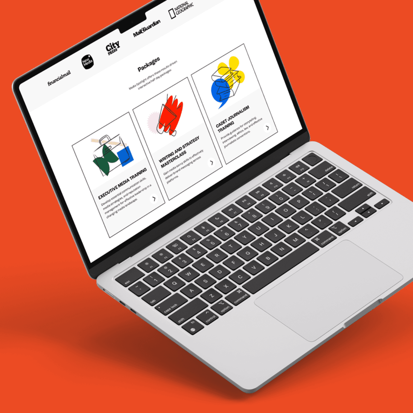
Media Spotlight is a boutique communications training company headed up by two award-winning former senior editors and media industry veterans who offer communications training packages for individuals and businesses in and around Cape Town, South Africa.
I was brought on board conceptualise, design, and develop a comprehensive brand corporate identity, a website, and additional brand collateral. These materials needed to appeal to large corporates, small businesses, and individuals alike.
The objective of the designs was to convey the business offerings in a straightforward, concise, and vibrant manner, emphasising a youthful energy and highlighting the educational aspect of their packages in an engaging way.
THE BRAND
THE BRAND
THE BRAND
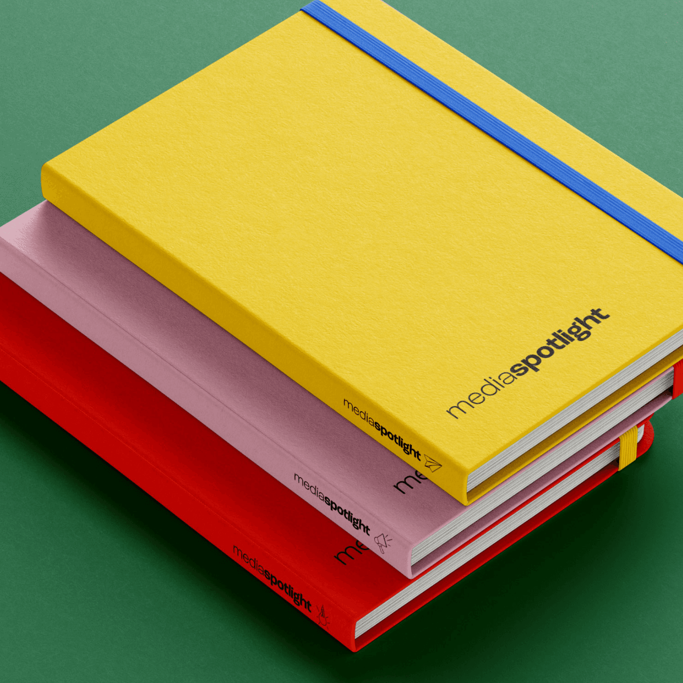
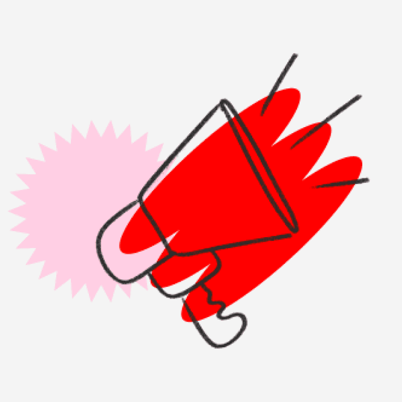
Drawing inspiration from the simple acts of a student at work guided me towards incorporating hand-drawn sketches and bright, engaging colours.
Using clean, simple shapes of solid, bold, bright colours lends to the idea of building blocks, learning new things, and rediscovering a childlike curiosity in a stimulating environment - working out how new ideas fit together and work with one another like puzzle pieces.
Additionally, it was crucial to develop a visual style robust enough to stand out amid the clutter of existing competitors in the higher education landscape, creating a memorable and enjoyable visual experience in contrast to the monotonous and mundane.










LIKE WHAT YOU SEE?
LIKE WHAT YOU SEE?
LIKE WHAT YOU SEE?